Project Overview
Fostering 'Art' & Community
Public Art includes murals, installations, sculptures, memorials, mosaics, tapestries, paintings, graffities, and many more. It is crucial for expressing our community values, enhancing our environment, transforming a landscape, heightening our awareness, or questioning our assumptions.Public art is scattered everywhere.
There are over 400 pieces of public art in the city of Toronto alone, and many probably may not know 1/10 of those. Majority of why this problem persists is because many people find public art to be unknown, inaccessible, or simply they choose to ignore it.
- Unknown — “I didn’t even know it existed!”
Some public art may be discreet so some people may fail to notice it or has gotten use to public art. - Inaccessible — “I don’t know how to get there!”
Some people could be living too far from public art places or are physiologically unable to visit. - Ignorance — “I don’t get it!”
Lack of knowledge about public art in general leads to lack of appreciation or acknowledgement of the art form.

The Solution
Fostering 'Art' & Community
ARTMMUNAL is an online website platform you can access anywhere that provides and recommends locations of public art, artists, and events near or far from you. It allows for a contributional effort of the community through engaging with a scavenger hunt and thoughtful discussions.
ARTMMUNAL aims to promote the public art scene across cities like Toronto by engaging communities to go explore and discover their city’s hidden and not so hidden artistic riches.
With our innovative platform, unleash your inner explorer and embark on a captivating journey that will turn your everyday surroundings into an exhilarating discovery of hidden and not so hidden artistic treasures through the heart of your city.


Brainstorm
What's the problem?
The project begins with investigating a specific area of interest to understand the target audience and their needs better. Below, I brainstormed several challenges that I could potentially tackle and developed concept maps of a few chosen topics I felt strongly about. In the end, I went with the idea of tackling the area of Public Art.

Competitive Analysis
What's out there...
A competitive analysis was conducted to understand existing applications and explore their features, leverage successful aspects, identify gaps, and avoid pitfalls for the potential solution.

steps public art app
A web and mobile application for you to explore murals and public art projects across Canada.
Pros: Relatively direct and easy to use for most parts of its content, relevant and helpful information about mural art and artists, no download necessary, includes technologies like a map and “scan & find” to locate art easily, calls for artist submissions
Cons: Unattractive visual identity, limited database on the amount of public art you can view, most technologies implemented are hard to use or unusable, unsure when it’s been last updated.

Street art cities
An easy way to explore street art all around the world, providing an overview of arts and artists both on a map and in a list.
Pros: Attractive visual identity, functional and easy to use, database is from all around the world, updated with community initiative, includes a technologies like a map, call for artist-submission (street art codes)
Cons: Few interface pain points, hard to tell on how to go back-and-forth (app), no filter options; art/artists are not sorted alphabetically ,no listening option for tours/routes
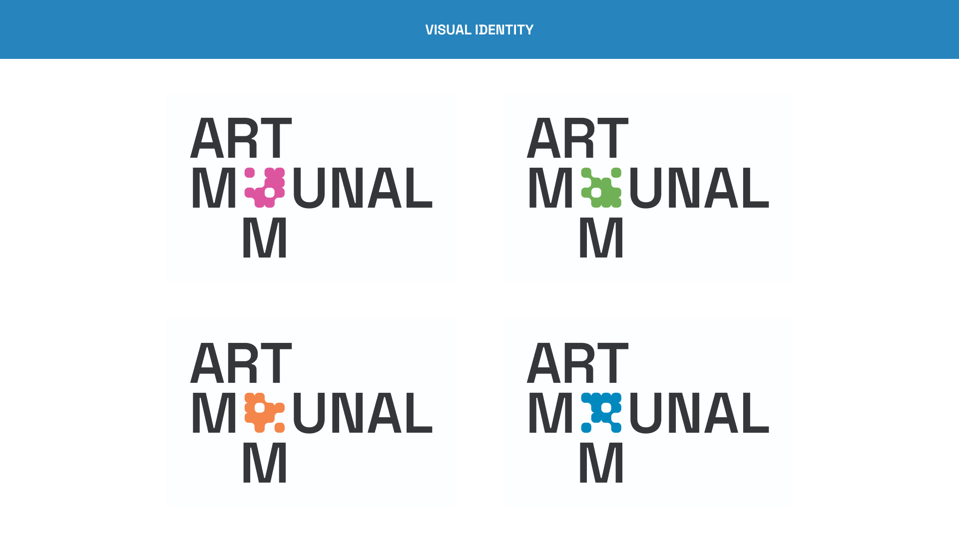
Visual Identity
Designing the brand
A visual identity was first established to develop to the application solution's brand recognition and strategy, user engagement, design handoff, and overall success.
User Flow
Streamlined Interactions
A user flow is created to visually outline the path that users follow within the application.

Wireframes
Mid-Fidelity Stage
Each group member was tasked with designing for one user flow. I was tasked with the search/calendar user flow wireframe.
After feedback from each group member’s low-fidelity, we mocked up the mid-fidelity to ensure we were all on the same page about the design direction.

Design System
Outlining visual consistency
In order to ensure a cohesive and polished look in the MVP, I've put in place a well-defined design program. This program outlines the color styles, typography, iconography, components, and layouts that are to be consistently applied across various screens of the product.
This approach not only enhances visual consistency but also streamlines the design process for a more efficient and harmonious user experience.
Mobile Prototype
Desktop Prototype
Establishing the brand
The first half of this project focused on establishing the visual identity for our solution. An emphasis was put into creating a modular branding that easily translates across different deliverables and platforms. With the established identity in place, I was able to create seamless and responsive UI interfaces without having to compromise its aesthetics.
Importance of user interviews
Given the project's fast-paced timeline, I couldn't conduct any user interviews and had to rely on anecdotes online. I believe the product could have benefitted significantly from these interviews, allowing for a more thorough understanding of user perspectives and refinement of the application's user flows.


